

Digest
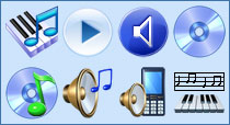
Quick Search and Easy Computing Solutions with Find Icon Clip-arts ListIcon cliparts basically represent a file, a folder of files, a computer application, a device on the operating system or even a web page that you open every day. These computer icon selections or search images correspond to distinct self-explanatory user setup.Accumulating The Best Icon Design Portfolio For iPhone and Android Application UseWhen you are developing an icon portfolio for your toolbar icons and application uses, many graphic software designers are looking for the best launcher icons for iPhone or Android because these application possibilities have become endless.Convenient Options for Effective Security Icon, security products and attractive designUsing attractive design of secure icon, security products as well as lock icons is one effective way of ensuring useful application that will get ahead of competition.Designing Interesting Tourism and Transportation Software Programs with Transport Symbols like png Buttons, Truck IconsWhen you are assigned the task of making tourism or transportation software programs and applications more user-friendly and interesting, the perfect transport symbols like png buttons, truck icons or GPS icons are necessary.Excellent Project Icons for your Website Design and Software DesignersOne of the important aspects of website design is the selection of unique project icons from icon archives. This miniature form of art is helpful in setting your website apart from other websites in its niche.Exploring more Worlds with Hot Communication Icon and Avatar Icon DesignsCommunication icons such as person icon and avatar icon have been an important ingredient to setting one's identity in web-based applications such as online chat, online gaming, social networks as well as business networks.Fun in Organizing your own Logo Design and Graphic Icons LibraryOrganizing your very own, custom-made and personally designed icon library is a good start in owning a fine logo design and icon sets for personal or online business purposes. Graphic icons set the rage in the World Wide Web.Help for Software Developers In Search Of the Perfect People Icons, gif Icons and Hand IconsAre you searching for people icons and other ICO images or what about the perfect GIF icon for your web application? When you need unique custom people icons, such as hand icons for the creation of avatars or user-groups, you can find them in this collection of 83 unique people icon choices.Perfect Engineering Icons and Symbols For Scientific Software DevelopmentFor those in specialized types of software program development, like in the case of scientific software or engineering applications, it can be hard to find custom symbols and objects or engineering icons you need.Software Development and Design Application With Unique Multimedia Icon PortfoliosIf you are in software development, you probably already know that your design application needs to offer a user-friendly experience that is visually enhanced with detailed and animated icons, or unique icons.Understanding the World of Net Icons, Network Clipart and Update IconsYou may have spent enough time in the internet to notice that most of its applications are directed by symbols or the use of net icons as well as network clipart to indicate certain applications.Where to Turn for the Perfect Icon Design When You Need a Custom IconFinding the perfect icon design or custom icon is important to the success of your application, especially if you want your program or utility to offer an enhanced user experience. |
|
Icon Software | Graphic Software | Icons Downloads | Order Icons | Windows Icon Sets | Support
Privacy Policy | Terms of Use | Refund Policy Copyright © 2000-2022 Aha-Soft. All rights reserved. |
|
|